News mobile app
UX & UI design
This project was a collaboration between EDIT School and Público, a leading Portuguese newspaper. Público provided us with a briefing for a comprehensive 360º project, and as a team of six, we were tasked with creating both a digital product (either an app or a website) and a marketing campaign. I was one of three designers responsible for developing the app or website. For this case study, I will focus solely on the app development, highlighting the areas where I played a direct role.
Context
MY ROLE
UX & UI designer
TIMELINE
TOOLS
SCOPE
DELIVERABLES
3 Weeks
Figma
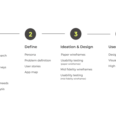
UX & UI design
User interviews
Desk research
Affinity mapping
Competitive analysis
User stories
App map
Paper wireframes
Mid-fidelity wireframes
Usability testing
Design style guide
Prototyping
The challenge
The briefing from Público was: "How to attract a younger target (18-25) to subscribe to the online subscription of Público". Currently the newspaper Público has a website and a mobile app, but they have problems captivating and retaining a younger audience to their online subscription. They challenged us to improve their current website/mobile app or to develop a new one, this decision should be based upon our research findings and then act accordingly.
Design approach
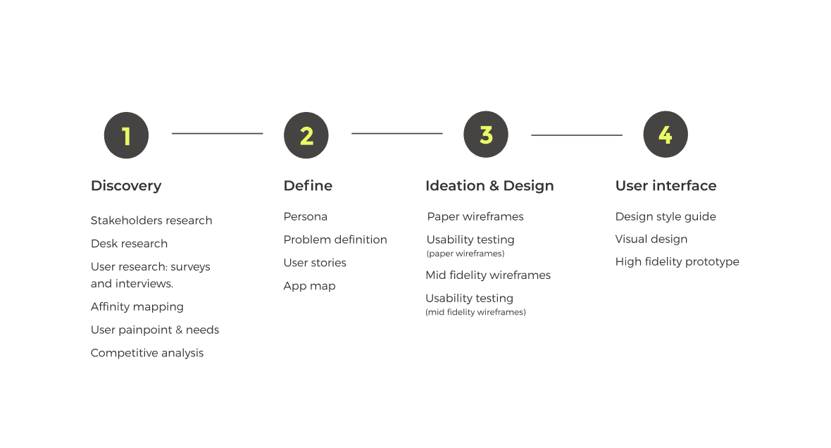
Discovery
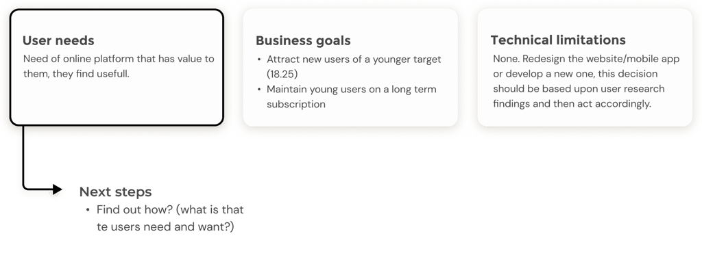
To kick-start the design process we had a meeting with two stakeholders from Público. Our focus was to extract information from three mains areas:
User needs.
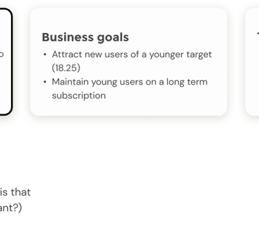
Business goals.
Technical limitations.
Stakeholders research
Digital subscription to Público means access to to all premium content of all of the Público news and its segments, through website and mobile app.
Público newspaper has diferent segmements within itself (eg. P3, P2, Fugas, Ímpar), all of them can be acessd throuth their website and mobile app. Some content is free to access, the rest is premium and a subscription is required.
P3 is a segment created specifically for a younger target (selection of more appropriate news)
Context infomartion
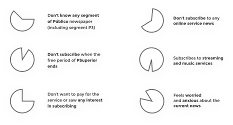
University students one year free digital subscription called Psuperior (with access to all of the newspaper segments). But, as soon as the free subscription ends students abandon the newspaper, not renewing to a paying subscription.
Young people, aged 18-5, (who don't ever have access to the free account) also rarely adhere to the Público subscription.
Young students say they don't renew due to financial issues.
Young people don't feel the value in having a subscription to Público. They feel that they don't take advantage of the digital Público subscription enough to pay a monthly fee.
Facts from Público:
User's insights collected from Público research:
Conclusion
We did some research about gen Z and Y news consumption. We consulted a report: "How young people consume news and the implications for mainstream media", by Flamingo commissioned by the Reuters Institute for the study of journalism, Oxford University. This report is based on the study of 20 people from gen Z and Y, from USA and UK.
Desk research
Our key insights withdrew from this research:
The Smartphone is the main device used for accessing news for the vast majority of under 35s (69%).
Nearly half of Gen Z news users (45%) in the combined sample (of users participants in this study) come into first contact with news in the morning via the smartphone.
Gen Z are more likely to turn to social media and messaging apps (57%). With 43% getting their news via social media and messaging apps and 33% directly.
Video format is good to engage, but should be noted even among Gen Z, the majority (58%) prefers text over video because of the control and flexibility that text still offers.
Gen Z are more likely to turn to social media and messaging apps (57%). With 43% getting their news via social media and messaging apps and 33% directly.
News publishers like the Guardian, BBC and Vox news work the best with gen Z.
We conducted online surveys and in-person interviews by reaching out to 7 people with ages between 18-25 years old.
User research
Goals for both the surveys and the interviews:
News reading habits
Reasons that lead the user to join/maintain an online news service.
How the use/adherence to an online newspaper impacts the life of a young person.
What is the user's behavior when subscribing to an online newspaper (frequency of use, type of news..etc).
What are the factors that lead users to choose to subscrib to a particular newspaper over another.
What kind of device do you use to access online newspapers.
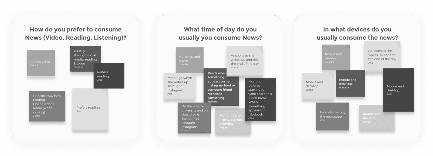
Surveys findings
Interview findings
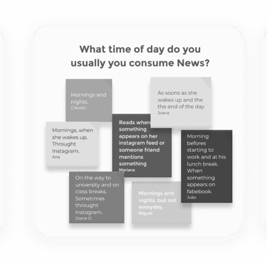
We mapped out user responses with an affinity diagram and grouped them based on needs, motivations and behaviors. The goal was to find the common user needs and wants of the target.
Fot this process we defined 20 topics. Here is represented a small sample of the affinity mapping.
Affinity mapping
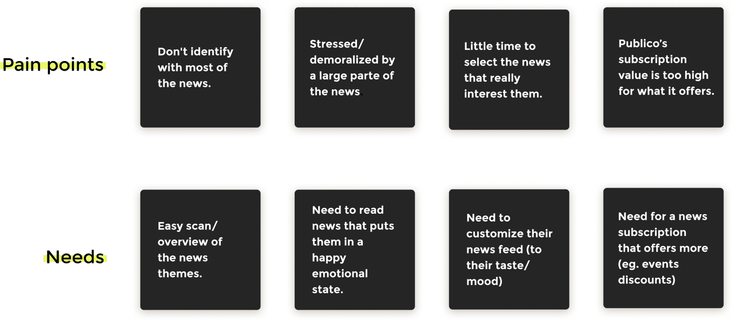
Having concluded and analyzed all of the user research data, the user pain points and needs found were the following
User pain points & needs
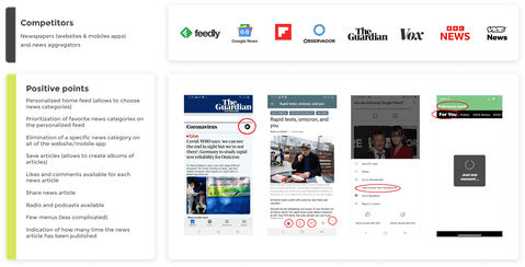
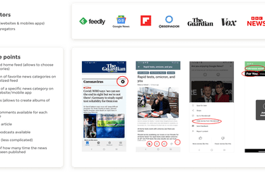
We did a complete competitive analysis of both direct and indirect competitors. We analyzed similar newspapers and news aggregators so we could see in what way do they communicate with their target market segment, analyzing their strengths and weaknesses. Below is a summary of positive insights taken from this analysis.
Competitive Analysis
What are we trying to solve?
Difficulty in attracting and retaining young people to a online subscription to Público newspaper (18-25 years).
Problem definition
Why is this a problem?
This is a problem because young people do not feel a connection to Público, they don't connect with their current website or mobile app. They want to acess news in a different way the current website/app provides.
What will we do?
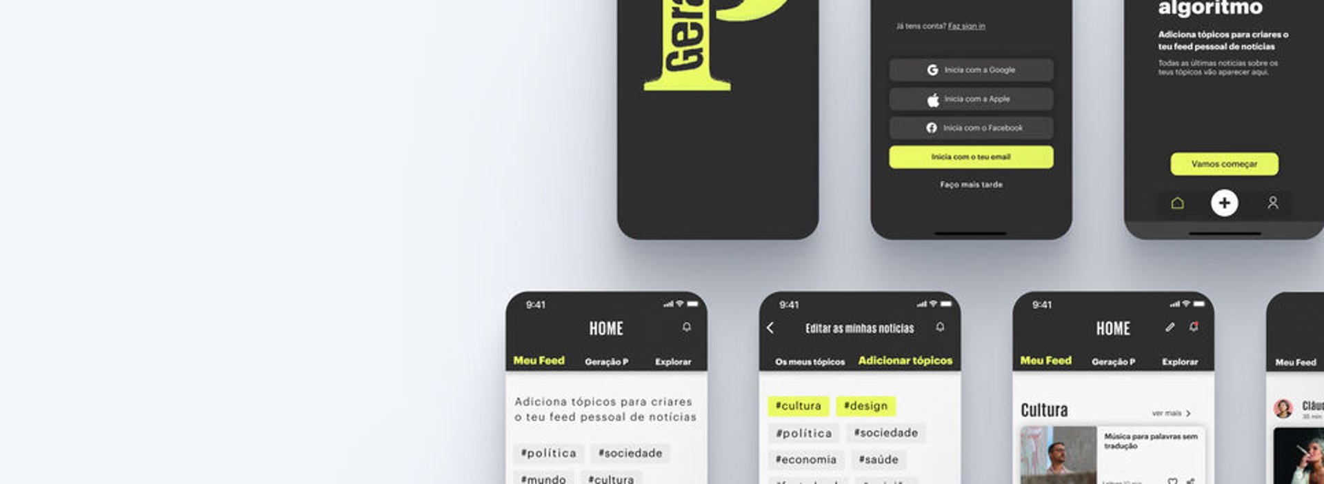
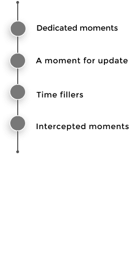
Develop an Público segment specifically to a younger target: "Geração P" (P generation). We'll develop a mobile app that answers to all the identified pain point and needs found during discovery stage. We opted to develop a mobile app due to this being a dispositive that younger generations have a bigger connection to: this way we can adress all the different moments they usually read news (mornings, durings breaks,on their way to jobs/classes, nights, etc.).
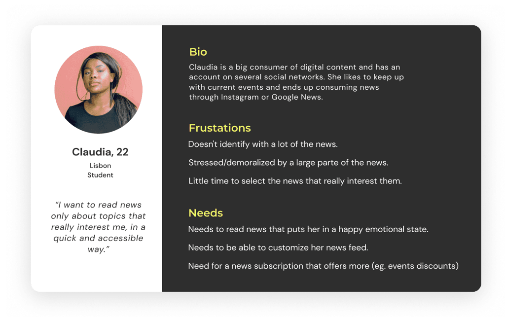
Having gathered all information from the user research and analysed all the commonalities between users (needs and frustrations of the sponsorship subscription) we created a persona representing the larger group.
Persona
Based on our user needs we created different user stories so we could better understand what features our app would need to have
User stories


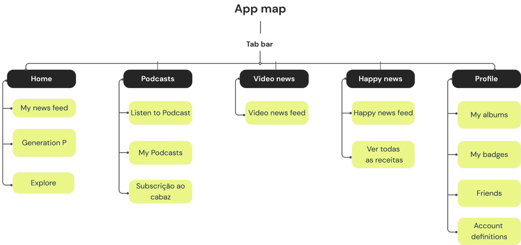
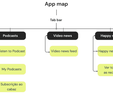
To start defining the possible structure of the app before starting designing the wireframes we did a hierarchical diagram representing the possible menus and screens.
App map
Ideation & Design
Paper wireframes: usability testing
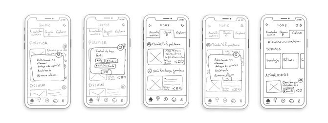
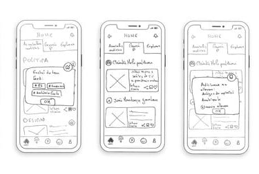
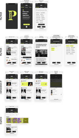
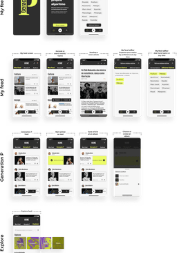
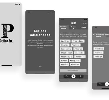
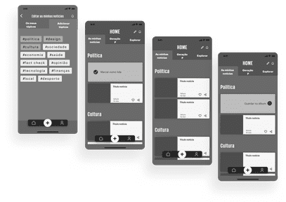
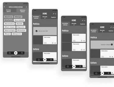
I was responsible for the design of the screen/flow of the menu "Home" and its submenus, so for the purpose of this case study, from now on, I will only detailed show the process of this design. I designed the paper wireframes in more detail and did a prototype in figma. After, it was conducted usability tests with potential users to identify possible painpoints.
Note: All the wireframes and final prototype are in portuguese due to the client being a portuguese newspaper.


Tasks asked to users to perform:
Add topics to your feed
Exclude a topic from your feed
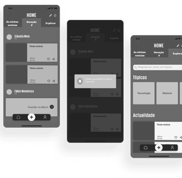
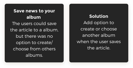
Save an article to your albums.
Share an article
Explore current news (on various topics)
Mid fidelity wireframes
Considering the previous usability tests fidings I developed the mid-fidelity wireframes and did a prototype in figma to test again with potential users.
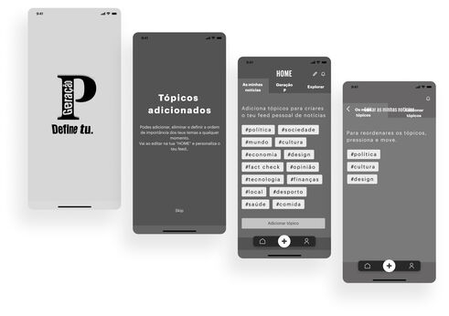
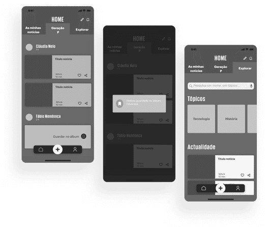
User interface
The next step was to design the style guide. The original color of Público newspaper is red, but once this app was target specifically to a younger target creating a new identity was important (as other segments of Público usually do) .
Design style guide
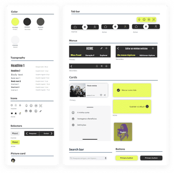

Then I proceed to the design the final visual design and did a prototype in figma.
Visual design & final prototype