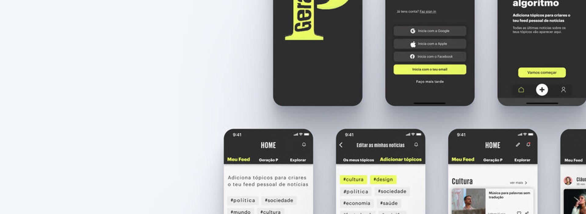
News mobile app
UX & UI design
Equalfood is a company that offers subscription-based produce boxes. We are a team of three designers who contacted Equalfood and volunteered to develop a proposal for a new app. We had access to all the company’s founders and their data, conducted interviews with clients, and used real data to inform our design, aiming to enhance their service with a more effective digital solution.
This project was undertaken on a volunteer basis and may not be implemented by Equalfoods.
Context
MY ROLE
UX & UI designer
TIMELINE
TOOLS
SCOPE
DELIVERABLES
3 Weeks
Figma
UX & UI design
User interviews
Affinity mapping
Competitive analysis
User stories
App map
Paper wireframes
Mid-fidelity wireframes
Usability testing
Design style guide
Prototyping
The challenge
Equalfood currently has a website where users can subscribe to their produce boxes. However, there is a growing need for a more streamlined and personalized subscription experience. To address this, we proposed designing a mobile app that better aligns with user needs while supporting Equalfood's goals.
Goals
Understand the target/users
Easy and fast subscription/checkout process
Create more engagement with costumers.
Engage costumers in a comunity with the same values.
Design approach - replace
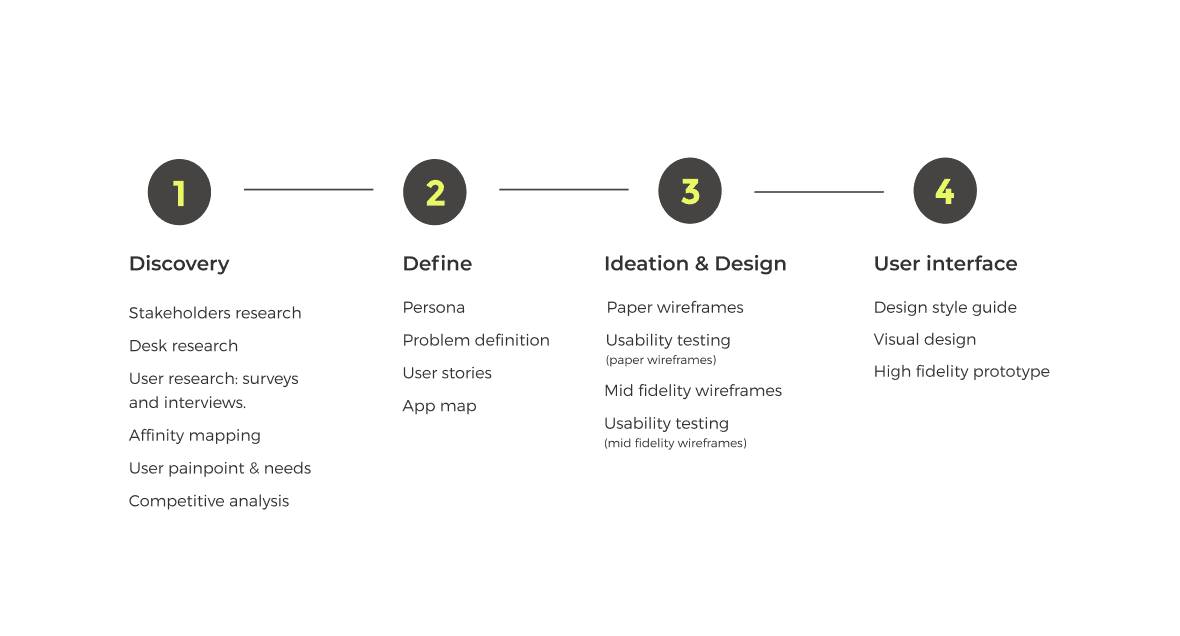
Discovery
Before approaching design, it was important to understand the core values of Equalfoods and what were they
goals for their business. An interview with a internal stakeholder from Equalfoods revealed valuable insights.
Equalfood's interview

We conducted in-person interviews by reaching out to potential users: people who cook regularly, have a somewat healthy lifestyle and have a full-time occupation. One of the interviewees had actually been subscribed to Equalfood’s service for a period of time.
User interviews
Understand how adhering to a service of home delivery ingredients would benefit their life.
How much commitment do they have about being zero waste food.
Did the users have ever use or give any consideration to a service like the one Equalfoods provides.
Understand the user’s online current shopping habits.
Interview goals
We mapped out user responses with an affinity diagram and grouped them based on needs, motivations and
behaviors.
Affinity mapping
Define
Based on the research findings, a persona was created: Isabel Costa - the archetypical with goals, needs and frustations that represent the needs of the larger group.
Persona
Based on Isabel’s needs we created different user stories so we could better understand what features our app would need to have.
User stories
After analyzing all insights from Equalfoods and our users, we defined which features were necessary.
Feature definition
Before we continued to develop layouts for each feature we did a complete competitive analysis on apps/websites that mainly sell and/or deliver food (groceries/meals) as direct competitors or as indirect competitors. This competitive analysis gave us better understanding of how apps are are providing a solution to their target market segment.
Competitie analysis
Apps/websites analysed
To start mapping the paths our users can take to do the 3 mains tasks we would develop we develop this user flows.
User flow
Having in consideration our research and having defined the main features we would develop, we did a hierarchical diagram of the structure of the app.
App map
Ideation & Design
We translated te paths we developed in the previous user flows to paper wireframes and made a functional prototype using marvel app. We did a testing round with 5 users in order to reveal possible usability problems.
Paper wireframes: usability testing
Key problems found:
After doing the necessary alterations according our previous usability tests we developed the mid-fidelity wireframes and did a simple prototype in figma.
Mid-fidelity wireframes
User interface
To define a particular style or concept we created a moodboard that helped us develop the visual interface of our app.
Moodboard
Our next step was developing our design style guide. Changing Equalfood’s logo was not an option, so we used a complementary color system that worked with their current logo and with their original blue. In this style guide is represented the te color scheme, typography and a large majority of components we used on the app.
Design style guide
How much food saved is in evidence on te top of the homepage
this way users can be reassured of how they are contributing to help
Tips & tricks where users can obtain useful insights and share their knowledge
this way the users feel integrated and engaged with the community
Recipes where users can get different recipes to cook with Equalfood's ingredients. Users can like the recipes and give their input through comments, this generates interaction within the community
this way users have always available recipes that are tried and verified by others.
Community news where users can get to know where their vegetables/fruits come from.
this way users can get to know the farmers and that they’re supporting local economy.
Visual design & final prototype
We designed an app for IOS following human Interface guidelines from Apple.
Homepage
Easy login, giving the user several options: e-mail, facebook, or mobile phone number.
Subscription process
Subscription topics/screens are easy and quick to understand. Based on previous test results:
Simplified subscription process through elimination of all hidden information.
Option to download the receipt.
Tips & recipes
Users can share their own tips and quickly search what tips are of interest to them by using the different filters available.
Users can share their own tips and quickly search what tips are of interest to them by using the different filters available.