Compensation costs
UX & UI design
This feature was designed and developed as part of a development cycle within the Meight company. The project was carried out by a dedicated team consisting of one designer, one project manager, and a group of engineers. note: I am only showing a part of this feature, as this is a complex one - rewrite this part
Meight is a freight/logistics tech platform, it serves trucking/transport companies, handling things like driver management, trip/telematics data, and driver compensation and payroll-adjacent workflows. Tailored for different personas involved in this area, this specific feature is aimed at HR and traffic managers.
Context
MY ROLE
Principal UX & UI designer
TIMELINE
TOOLS
SCOPE
DELIVERABLES
5 Weeks
Figma
UX & UI design
Feedback session insights
User flows
Concept development
Low-fi wireframes
Hi-fi wireframes
Prototypes
The challenge
Meight's customers currently calculate driver travel allowances by hand, using spreadsheets and their own reading of labor law that varies by country and contract type. We're replacing this with a rules engine: agreements become clauses with triggers and priced items, and the system auto-calculates pay from trip data, with HR configuring it and managers reviewing before payroll.
The design challenge: make something legally rigid and rule-based feel simple and trustworthy for non-technical users. Customers need flexibility, but many values are legal minimums they can't change. They want automation, but still want to inspect and override individual items. And everyone approves differently - by day, by trip, by rate comparison - so the design has to flex to all of it without needing a developer every time.
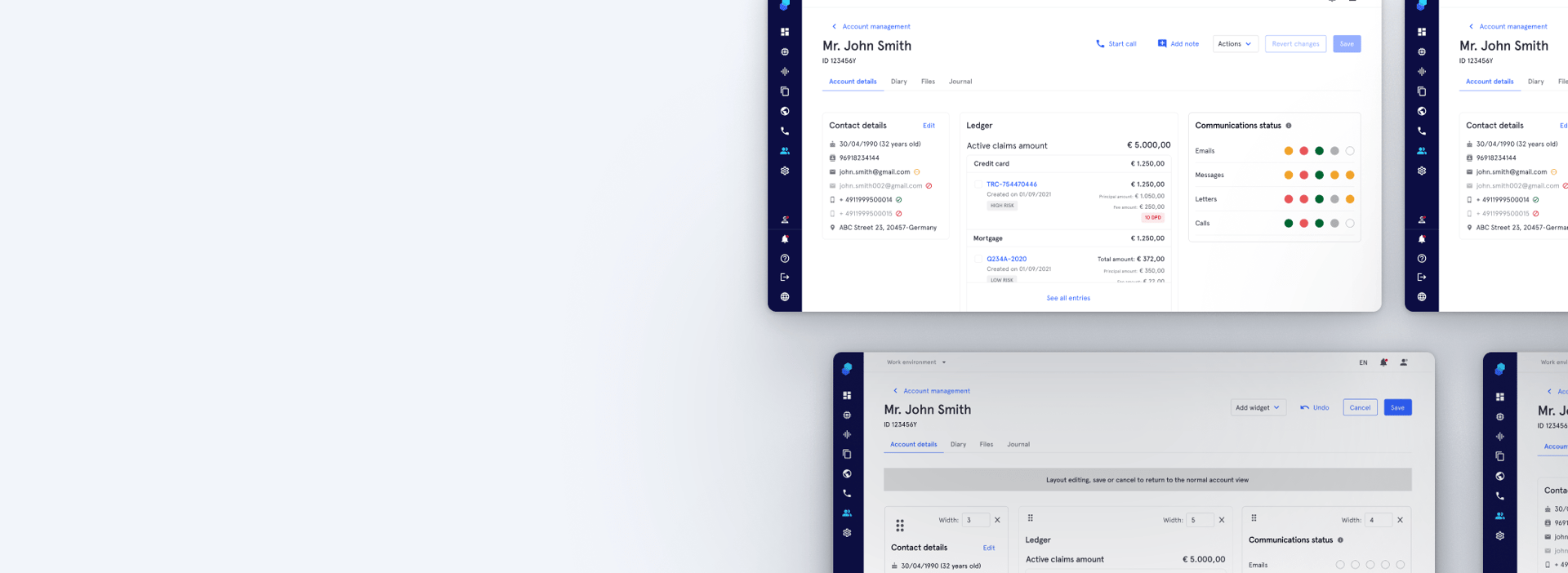
The communication status widget, available within each account, gives agents a quick, real-time overview of debtor interactions across multiple channels. This intuitive tool allows agents to easily track communication effectiveness and debtor engagement, helping them make informed decisions with minimal effort. Key features include:
Quick overview
The challenge
🌈 Visual communication summary: agents can now view a color-coded widget that provides a quick, visual summary of the debtor’s responsiveness across various communication channels (e.g., email, phone calls, landing page visits).
📬 Track engagement per channel: the widget displays the status of each communication type, allowing agents to see whether emails were opened, calls were answered, and landing pages were visited.
🔍 Communication's insights: instantly determine which communication channels are working best for each debtor, helping agents decide on the most effective way to reach out.
⏱ Real-time status updates: communication status is updated in real-time, giving agents the most up-to-date information to guide their decisions.
Target personas: Collection agents
Understanding the problem
These problems surfaced through interviews and feedback sessions with several customers as we scoped how the driver compensation system should work in practice
Key problems
Massive time cost every month: the whole manual process of feeding data in and calculating allowances eats up significant time for finance/ops teams, every single month.
01
Automation vs. trust: The system auto-calculates driver pay, but every customer wants to check, adjust, or override it before approving.
Letting customers build their own exceptions safely: Custom subsidies, driver-specific flags, one-off rules, users need to add these themselves, without engineering.
02
03
Legal minimums vs. customization: Values are legal minimums, but companies still need to configure and add their own rules
Manual data entry from telematics: users have to take trip data (routes, hours, km) and manually type it into spreadsheets before anything can even be calculated.
Fragile, personalized Excel formulas: each customer maintains their own complex spreadsheet logic to encode the rules, which is hard to maintain, easy to break, and impossible to hand off.
Today's pain points
Design challenges we'll face
Using prototypes to drive user research


We started with a broad understanding of the problem, but needed deeper insights from users. Instead of waiting until the solution was fully defined, we created high-level user flows and translated them into functional prototypes to use as conversation starters. To do this I leveraged the Figma Make's rapid prototyping capabilities.
I designed and facilitated research sessions in two parts. First, I interviewed participants about their role, current workflows, frustrations, and goals. Then, they explored the prototypes and discussed how the proposed solution fit, or didn't fit, the way they worked.
Using interactive prototypes encouraged more concrete feedback than interviews alone, helping us uncover specific pain points, unmet needs, and opportunities that guided the next iterations of the product.
Put users needs results from first round of usability testing
User needs
# 1 As a user, I want to create and manage payslip items in a dedicated section, so that I can define each line that will appear on a driver's payslip
User story # 1
# 2.1 As an account admin, I can define company driver contracts, so driver variable compensation is correctly configured
#3 As an HR assistant, I can approve driver daily compensation, so it can be added to the driver payslip
User story #2
User story #3
# 2.2 As a user, I want to add contract details to a driver's profile, so that the system can use that information to accurately calculate their compensation
# 7 As a user, I want to create a payslip for a driver and approve any pending workday logs directly during the payslip creation process, so that all working days are validated and accounted for before the payslip is generated
As an agent who needs to contact a specific number of debtors each day,
I want an efficient way to access essential information about each debtor,
so that I can quickly prepare for each contact and manage my daily tasks effectively without spending time navigating through complex systems.
# 11 As a user, I want to consult the payslip history of each driver so that I can review past payments and compensation details.
Ideation & Design
The two purple boxes are the setup layer — where you define what things cost and how (items and their formulas). The two teal boxes are the operational layer — where that setup gets applied to real drivers and turns into actual daily numbers. note: say that first with PM and engineering we defined how this structure to calculate price could work logically, and once that was defined and validated as possible I could build the designs and user flows around that
System flow and user flow


I designed the user flows based on the product requirements. I then translated those flows into functional prototypes using Figma Make, enabling rapid visualization and interaction. Once the prototypes were ready, I reviewed, validated, and iterated on them together with the Product Manager to ensure they met both user needs and business objectives. Afterward, I used Claude to help synthesize a structured feedback session plan, and we conducted several rounds of usability testing with our existing clients. The insights gathered from these sessions informed further refinements to the prototypes and the overall user experience.
Feedback from users:
Adding the communication widget to the account screen
Final design
Communication widget in use within the account


mostro figmas e depois mostro portotipos claude para testar, fully functional. Mostro as formulas e tudo mais


The communication status widget has significantly streamlined the process of analyzing communications and debtor interactions. Previously, agents had to sift through cluttered logs to gather insights, which was time-consuming and inefficient. Now, agents can quickly access all relevant communication data in a clear, visual format, saving valuable time in their day-to-day tasks. This allows agents to focus more on strategic decision-making and debtor engagement, ultimately enhancing productivity and performance.
Overall, the widget enhances agent performance by:
Streamlining workflows: eliminates the need to manually search for communication data, reducing task complexity.
Improving decision-making: provides immediate insights into debtor responsiveness, leading to more effective contact strategies.
Increasing productivity: frees up time for agents to engage in higher-value tasks, boosting overall efficiency.
Enhancing debtor relationships: enables agents to tailor their approach based on debtor engagement levels, potentially improving recovery rates.
By addressing a significant pain point, the Communication Status widget empowers agents to work smarter and achieve better outcomes.
Conclusion
We will monitor how agents use the widget and assess the need for additional features, such as more communication channels, statuses, and customization options—including color preferences to improve accessibility for color-blind users. Our goal is to enable agents to personalize widget states and colors to match their preferences and accessibility requirements.
For the initial launch, we kept the widget simple to avoid overwhelming users and to give agents time to familiarize themselves with the feature. As we gather feedback and usage data, we'll make necessary adjustments and enhancements.
Next steps
© 2025. All rights reserved.